we updated the ibbe careers board because the old version felt functional but incomplete. it worked, but it lacked the clarity and warmth we promise in everything we build. this update is about respecting your time and creating a space that feels calm, intentional, and easy to navigate.
the first thing we addressed was color. gradients looked polished at first glance, but they introduced visual noise that pulled focus away from what matters. we stripped them out entirely and committed to solid blocks of signal blue, charcoal, and bone white. this creates a visual hierarchy that guides your eye naturally. the result is a board that feels premium without trying too hard.
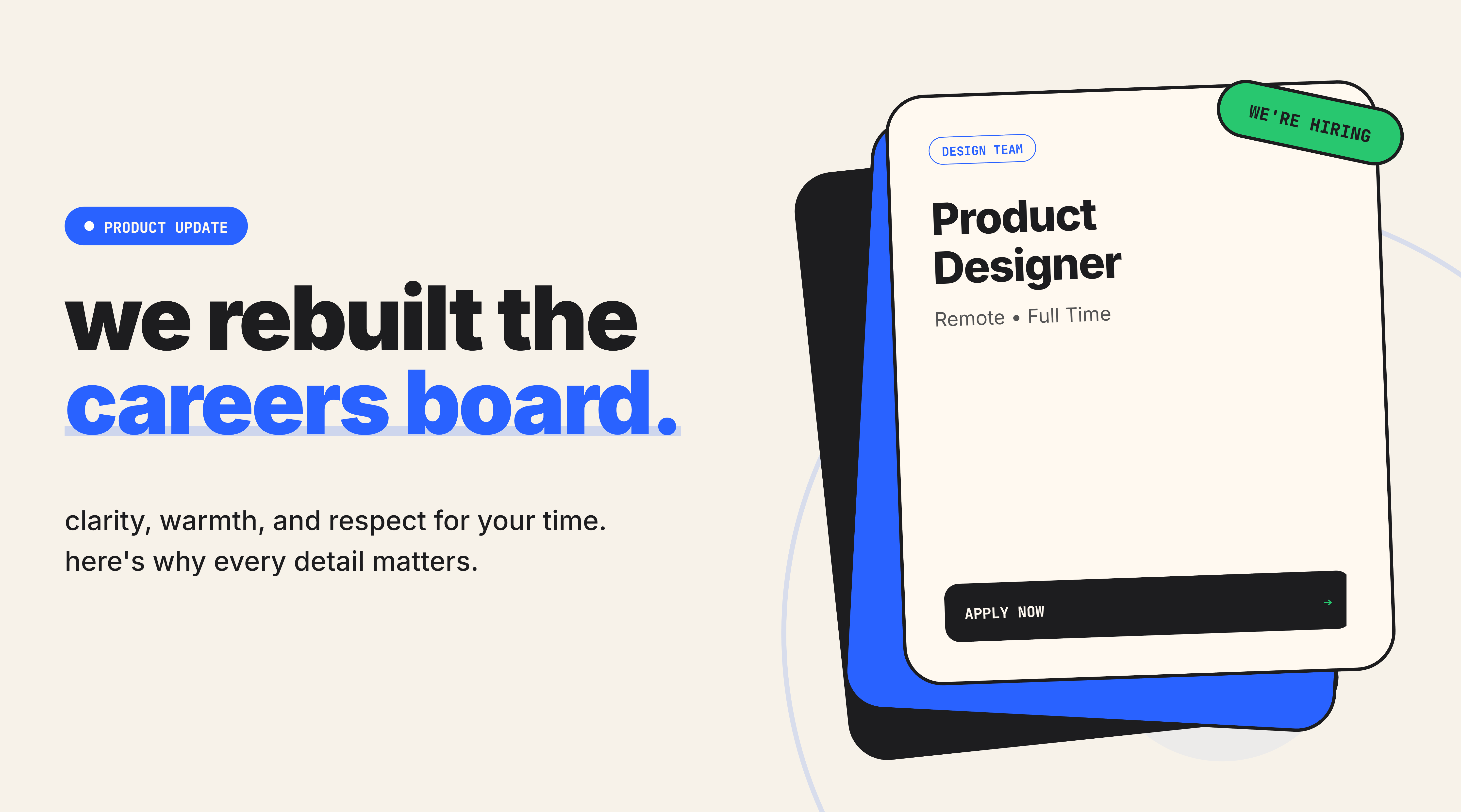
we redesigned the job cards to respond to how people actually browse. the entire card is clickable now, which means fewer missed clicks and less frustration. when you click, a loading spinner appears immediately. this tells you the system heard you and is working. it's a small gesture, but it removes the uncertainty that comes with waiting for a page to load.
hover effects were added to make the interface feel alive. when you move your cursor over a card, it scales slightly and rotates just a degree. this subtle motion creates a tactile sensation, as if you're interacting with something physical. it signals that the system is responsive and built with care. the job details page was split into two columns. on desktop, you see an "about this team" sidebar on the left that stays visible as you scroll. on mobile, it moves to the top. this keeps context close without repeating information or cluttering the main content. the layout adapts to your screen, which means the experience feels intentional regardless of how you access it.
filtering became smarter. we renamed "categories" to "teams" because it's clearer and more human. filters now sync with the url, which means you can share a filtered view or bookmark it. when you visit a link with a team filter already applied, the board opens with results ready. this removes extra steps and respects the way people share opportunities with friends.
we added a "recently viewed" feature that stores your last five jobs in local memory. when you click the search bar, these jobs appear in a dropdown. this lets you return to opportunities you were considering without hunting through your browser history. it's a small feature, but it acknowledges that career decisions take time and multiple visits.
pagination now scrolls you back to the top of the results automatically. this prevents the disorienting experience of clicking "next page" and landing halfway down the screen. it's a detail most people won't notice consciously, but it makes the flow feel smoother and more predictable. search logic was enhanced with an acronym dictionary. if you type "svp," the system understands you mean "senior vice president." this improves recall and reduces the cognitive load of guessing exact titles. it's a technical improvement that translates to a more intuitive experience.
the technical foundation was strengthened with url-aware state management and refined component structure. filters, search terms, and pagination all persist in the url. this means the board behaves predictably. you can refresh the page or share a link and trust that it will open exactly as you left it. every change was guided by a single question: does this help students find the right opportunity with less friction? we removed visual distractions, added feedback loops, and refined the navigation logic. the goal was to create a board that feels calm, responsive, and built for real people making real decisions.
this update reflects the standard we hold ourselves to. we believe tools should respect your intelligence and your time. the careers board now does both.